Group Ignited
Group Ignited believes that organizations have the potential to use the creative process on-demand to solve business problems. My mission was to help them communicate to their clients how the Group Ignited team helps train organizations learn how to be unique problem-solvers.

The Mission
Innovative business consultants needed to eliminate the dissonance between their energetic live facilitations and their currently impersonal online representation. My mission was to help them communicate to their clients how the Group Ignited team helps organizations learn just how to wield the sword of innovative problem solving to fix their internal business problems, so they can get back to doing what they do best.

The Outcome
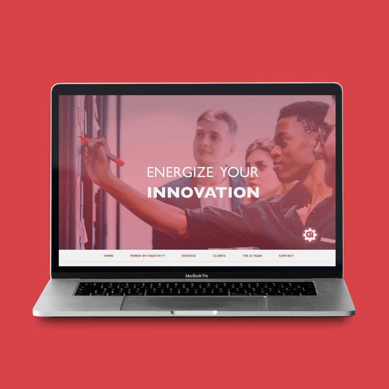
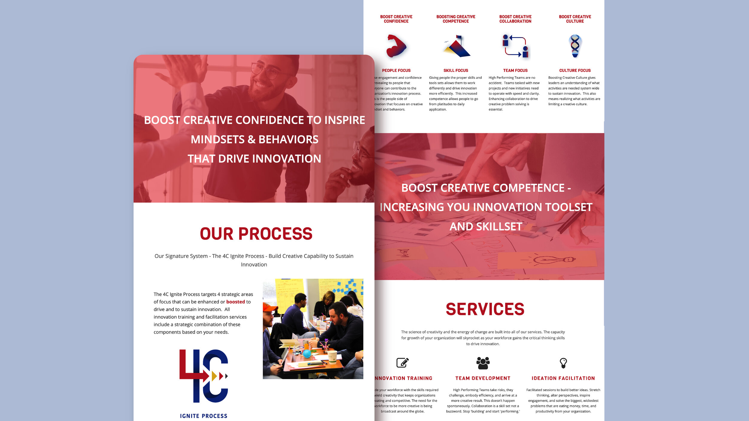
I designed a logo for their 4C Ignited Process to capture the one-of-a-kind value in their specialized problem-solving process. I also designed their iconography, refreshed the Group Ignited website to help build a front door to illustrate what it looks like to feel empowered by Group Ignited team building sessions.

The Process Logo + The Logo Process
Their word choice also reveals the mood of their brand. I wanted to show confidence through a strong and bold font, and visualize competence by making a logo for the 4C Ignited Process that could stand on its own. I tied in culture by making sure that the brand colors all worked together in unity. The collaboration theme was explored through the use of space and creating figures inside the letter C.

How to Create Engaging Visuals
I dove into thinking about what engaging in the 4C process feels like. A process, in my mind, is a tested method of receiving similar or reliable results. You have a system that allows you to efficiently accomplish a goal and make repeatable success. I brainstormed symbols that represented motion, movement, steps, and success. I then focussed on the meaning of their name and what their teamwork brings to their clients. Clients look to them to provide direction and inspiration for solving business problems. I wanted to reflect that creative and expert energy in their new identity.

Refreshing The Site + Mobile First
Instead of completely changing the site, for this soft relaunch of the site, we decided to keep the original layout of the site and improve the current design with their unified color palette, navigation, calls to action, images, SEO, logos, typography, and color grading. We faced a little pushback with the font choice but ended up deciding on utilizing the current font for the body of the site and using a separate font for the cover image of the site. We wanted to make sure that their mobile site was usable and easy for visitors to find information.

The Impact
Since the website launched with the updated branding, bounce rates have decreased, the team has found that more people are willing to reach out to them for services after learning about their work and take more interest in their business by pursuing calls to action.
